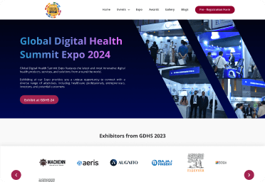
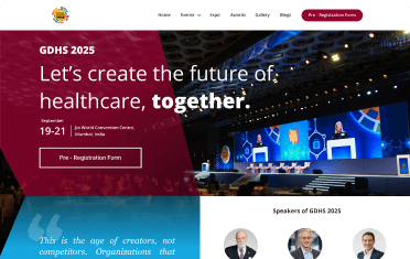
I redesigned the Global Digital Health Summit’s website to improve conversion and streamline the journey from discovery to registration, while strengthening the digital experience for attendees and supporting key business goals such as sponsor acquisition.
Company
Global Digital Health Summit
Timeline
2 weeks
Role
Lead UX Designer
Project
Shipped

Project Overview
Global Digital Health Summit (GDHS) is an annual digital health conference operated as a dedicated strategic business unit (SBU) within Digital Health Associates.
The summit functions as a revenue‑generating vertical for the company, with attendee registrations and sponsorships as its primary business channels. The website is the only platform through which both of these transactions occur.
While marketing efforts successfully brought traffic to the website, a significant portion of visitors were not completing registration or sponsor inquiries. This limited the SBU’s ability to scale revenue from both attendee tickets and brand partnerships.
Challenge
The challenge was to turn a content heavy event product into a clearer & more conversion focused experience. The redesign needed to simplify and improve the navigation and the content hierarchy and also make key journeys such as registration easier to complete across desktop and mobile.

User Problem
Visitors came to the site to
Understand the summit - Choose a ticket - Register - Explore Expo & sponsorship
But the experience got in the way
Dense content - Weak hierarchy - Unclear CTAs - Fragmented registration - Low trust signals
Constraints
01
1-2 Weeks
Compressed timeline for the redesign and launch.
01
3-4 SBUs
I was the sole designer across GDHS and multiple other digital products.
01
Design + execution
Alongside UX/UI, I handled on-ground design requirements and remote print coordination.
Goals & Success Criteria
Business
- Reduce drop-offs and increase registration completion through ticket selection and checkout.
- Strengthen sponsor & exhibitor journeys which would then make the commercial opportunities easier to discover and act on.
Experience
- Clarify the information structure so as to make the summit easier to understand and navigate.
- Build trust & credibility through the content, outcomes and speaker information.
- Give users enough clarity to make decisions without manual clarification.
Discovery & insights
The Process
I triangulated feedback from:
Design review - Google Analytics - Microsoft Clarity - Sales & operations feedback - Internal usability testing
The Insights
- Dense content made it difficult to distinguish primary information from secondary content.
- Actions didn't look like actions : Register, Expo and Sponsor lacked enough visual distinction from surrounding content.
- Key Journeys/ Important actions weren't always presented as an obvious next step.
- Users struggled to understand ticket differences and pricing.
- Sponsors and exhibitors were pushed into attendee-oriented flows.
Project Strategy
01
Reduce cognitive load at decision points
01
Separate attendee and sponsor journeys clearly
01
Build trust before asking for commitment or payment
Landing Page Design

Other Notable Screens